Forms are one of the most important parts of any website. Whether someone is booking a service, filtering products, or filling out a quote request, the type of input you use can make the difference between a completed submission and an abandoned page. Yet most small business owners (and plenty of developers) give very little thought to which form control to use and just reach for whatever looks familiar.
Three controls that often get confused are the combobox, the multi-select, and the listbox. They look vaguely similar, they all let users pick from a list of options, but they serve quite different purposes. Picking the wrong one frustrates users and quietly kills conversions. Here is a plain-English breakdown of each one and when to use it.
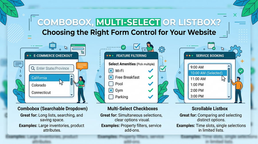
What Is a Combobox?
A combobox combines a text input field with a dropdown list. The user can either type to search and filter the options, or click to open a dropdown and choose from the list. Google’s search bar is the most famous example, but you will see it used everywhere from airline booking sites to e-commerce category filters.
The key feature is the typing. Because users can filter the list as they type, comboboxes work brilliantly when your list of options is long. Think country selectors, product categories with dozens of entries, or a job title field where there are hundreds of possible answers.
When should you use a combobox on your site? Consider it when:
- Your list has more than about 10 to 15 options
- Users are likely to know roughly what they are looking for and will type to find it faster
- You want to allow a single selection only
- You need to support both free-text input and predefined options (for example, letting someone type a custom value if their answer is not in the list)
A practical example: if you run a trade directory and your enquiry form asks users to select their industry from 80 options, a combobox will save them a lot of scrolling.
What Is a Listbox?
A listbox is a scrollable box that displays a list of options in full, with no hidden dropdown. Users click an item to select it. By default, most listboxes only allow one selection at a time, though they can be configured to allow multiple selections with Ctrl or Shift clicking.
Listboxes are best suited to situations where the number of options is small enough to display all at once and where you want the user to be able to see all their choices without any extra interaction. They are particularly useful in settings or preference panels, for example on a dashboard where a user is choosing which report columns to show.
Use a listbox when:
- You have a short, fixed list (roughly 4 to 8 items is a comfortable range)
- You want all options visible at once without the user needing to open anything
- The context is a settings panel or configuration screen rather than a quick form fill
- You only need a single selection and a simple dropdown feels too hidden
One caution: listboxes can look heavy and outdated on modern websites if they are not styled carefully. They work best in web applications and member portals rather than on a public-facing contact or booking form.
What Is a Multi-Select?
A multi-select control lets users pick more than one option from a list. The classic HTML version is the <select multiple> element, which looks like a listbox but allows users to hold Ctrl (or Cmd on a Mac) and click several items at once.
Here is the problem: most people do not know they can hold Ctrl to select multiple items. Research consistently shows that the standard HTML multi-select has poor usability because the interaction model is not obvious. Accidental single-clicks also deselect everything the user has already chosen, which is incredibly frustrating.
For that reason, modern multi-select components are usually built as custom UI elements rather than the raw HTML control. Common approaches include:
- Checkbox lists (a vertical stack of checkboxes, each labelled clearly)
- Tag-style inputs where selected items appear as removable chips or badges
- Dropdown lists where each option has a checkbox next to it
When should you allow multiple selections at all? Use it when your users genuinely need to pick more than one thing. Good examples include filtering products by multiple colours or sizes, selecting several services on a quote form, or choosing which days of the week work for an appointment. If users will realistically only ever pick one thing, stick to a single-select control and keep it simple.
A Quick Side Note: The Dual Listbox
You may occasionally come across a dual listbox, which shows two side-by-side lists with buttons to move items from one to the other. It is useful in very specific admin scenarios, such as assigning team members to a project or building a custom email list. For most small business websites, you will never need one. If you do encounter a situation where it feels tempting, ask yourself whether a simple checkbox list would do the same job with less complexity.
Practical Guidance for Small Business Websites
If you run an e-commerce shop, a service business, or a local trade company, here is a straightforward cheat sheet for the most common form scenarios.
- Booking or quote forms with a single service or category choice: use a standard dropdown (select) if there are fewer than 10 options, or a combobox if there are more
- Filtering products by a single attribute (e.g. colour): use a dropdown or radio buttons
- Filtering products by multiple attributes (e.g. size and colour together): use checkbox lists, one group per attribute
- Selecting multiple services on an enquiry form: use a checkbox list with clear labels, not a multi-select HTML element
- Choosing a country or long list of locations: use a combobox with search
- Settings or preferences in a member area: a listbox or checkbox list both work well
The underlying principle is always the same: match the control to the task, not to what is easiest to drop into your page builder. A checkbox list takes a little more effort to build than a raw multi-select, but if it stops users abandoning your form halfway through, it is absolutely worth the investment.
Small Details, Big Impact on Conversions
It might feel like a small thing, but the form controls on your website directly affect how many enquiries and sales you actually get. A confusing filter on a product page means fewer purchases. A clunky booking form means fewer appointments. A frustrating quote request form means leads going to a competitor whose site just worked better.
If you are not sure your current forms are working as well as they could, it is worth asking a developer to review them. Sometimes a single change, like replacing a broken multi-select with a clean checkbox list, can make a noticeable difference to your conversion rate without touching anything else on the page.
Good web design is not just about how a site looks. It is about how it works for the people using it. Getting the small details right is exactly where that work happens.