Most small business owners know when a website feels wrong. It looks cluttered, takes forever to load, or just doesn’t feel trustworthy. But pinning down why it feels wrong, or knowing what to ask for when briefing a designer, is a different challenge altogether.
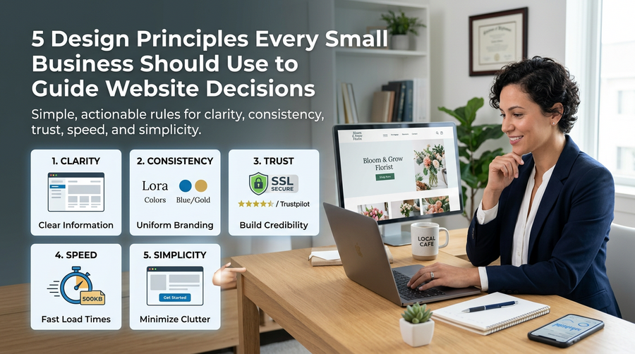
Design principles give you a framework for making those calls. Not as abstract theory, but as practical rules you can apply when reviewing your own site or sitting down with a web designer. Here are five that matter most for small businesses.
1. Clarity: Your Visitor Should Never Have to Guess
The number one job of your website is to communicate clearly. Within a few seconds of landing on your homepage, a visitor should know who you are, what you offer, and what they should do next.
If your headline says something like “Empowering Connections Through Innovation”, you have a clarity problem. Compare that to “Plumbing and Heating Services in Worthing” with a phone number front and centre. One answers the visitor’s question immediately. The other makes them work for it.
When reviewing your website, ask yourself this: if a complete stranger landed on your homepage right now, could they explain your business to someone else within ten seconds? If the answer is no, clarity is where to start.
2. Consistency: Build Recognition Without Thinking About It
Consistency is what makes a website feel professional rather than cobbled together. That means your fonts, colours, button styles, and tone of voice should all follow the same rules from one page to the next.
When things look different on different pages, visitors notice, even if they can’t say exactly why. It creates a low-level sense of distrust. Small things matter here:
- Using the same primary colour for all your call-to-action buttons
- Keeping your logo in the same position on every page
- Writing headings in the same tone throughout
Consistency also extends to your wider brand. Your website should feel like a natural continuation of your business cards, social media profiles, and email footer. When everything matches, you look established and reliable.
3. Trust: Give People a Reason to Take the Next Step
People buy from businesses they trust. Your website needs to earn that trust quickly, especially if a visitor has found you through a search and has no prior connection to your business.
The good news is that trust signals are straightforward to add. Some of the most effective ones for small businesses include:
- Real customer reviews and testimonials, ideally with names and locations
- A clear “About” page with photos of you or your team
- Logos of professional bodies or accreditations you belong to
- A physical address and local phone number
- An SSL certificate (the padlock in the browser bar)
Avoid the temptation to use stock photos of smiling people in suits. Real images of your actual work, premises, or team will always do more for trust than generic imagery.
4. Speed: Every Second Costs You Visitors
Google’s own research has shown that as page load time increases from one second to three seconds, the probability of a visitor bouncing increases by 32%. By the time you get to five seconds, that figure jumps to 90%.
For small business websites, slow loading is often caused by a handful of fixable issues:
- Large, uncompressed images
- Too many plugins running in the background (common on WordPress sites)
- Cheap hosting that can’t handle even modest traffic
You can test your current site speed for free using Google PageSpeed Insights. It will flag the specific issues dragging your score down and tell you which ones to prioritise. A good web design agency will handle all of this as part of a build, but it’s worth knowing what to look for when you’re briefing someone.
5. Simplicity: More Options Usually Means Fewer Conversions
There is a well-known concept in psychology called Hick’s Law, which states that the more choices you give someone, the longer they take to decide. On a website, longer decisions often mean no decision at all.
This principle shows up everywhere. A navigation bar with twelve items is harder to use than one with five. A homepage crammed with eight different calls to action confuses visitors who aren’t sure where to go. A contact form asking for ten pieces of information will be abandoned more often than one that just asks for a name, email address, and a brief message.
Simplicity is not about making your website look minimal or sparse. It is about removing anything that doesn’t serve a clear purpose. Every element on a page should earn its place by helping a visitor understand something or take an action.
How to Use These Principles in Practice
If you’re thinking about a redesign or about to brief a designer, these five principles give you a useful checklist. Go through your current site and ask:
- Is it immediately clear what we do and who we do it for?
- Does everything look and feel consistent across every page?
- Are there enough trust signals to reassure a first-time visitor?
- Does the site load quickly on mobile as well as desktop?
- Have we kept things simple, or are we giving people too many choices?
You don’t need a design background to apply these rules. You just need to look at your website the way a new visitor would, rather than someone who already knows the business inside out.
If you’d like a second opinion on how your site measures up, get in touch with the team at Samson Web Design. We’ve been helping small businesses across West Sussex build websites that actually work since 2006, and we’re always happy to take a look.