Most small business websites have the same problem. They look decent enough, load reasonably quickly, and are easy enough to navigate. Yet enquiries trickle in slowly, or not at all. The owner fidgets with button colours, tweaks a headline, and waits. Nothing shifts.
The missing piece is usually persuasion. Not manipulation, not dark patterns, but the kind of honest, psychology-informed design that guides a real person from “just browsing” to “yes, I want this.” The good news is that the core principles behind this have held up well. They just need applying properly, with a bit more nuance than the pop-psychology checklists floating around in 2015.
Usability Is the Floor, Not the Ceiling
Getting usability right is necessary. If your contact form breaks on mobile, nothing else matters. But once the basics work, fixing usability further gives you diminishing returns. You cannot usability-test your way to a 40% uplift in enquiries.
Persuasion picks up where usability leaves off. It answers questions your visitor hasn’t typed yet, reduces the emotional friction of committing, and makes the right action feel like the obvious next step. Think of it as the difference between a clear shop layout and a skilled sales assistant who knows exactly what to say.
Trust Signals That Actually Do Something
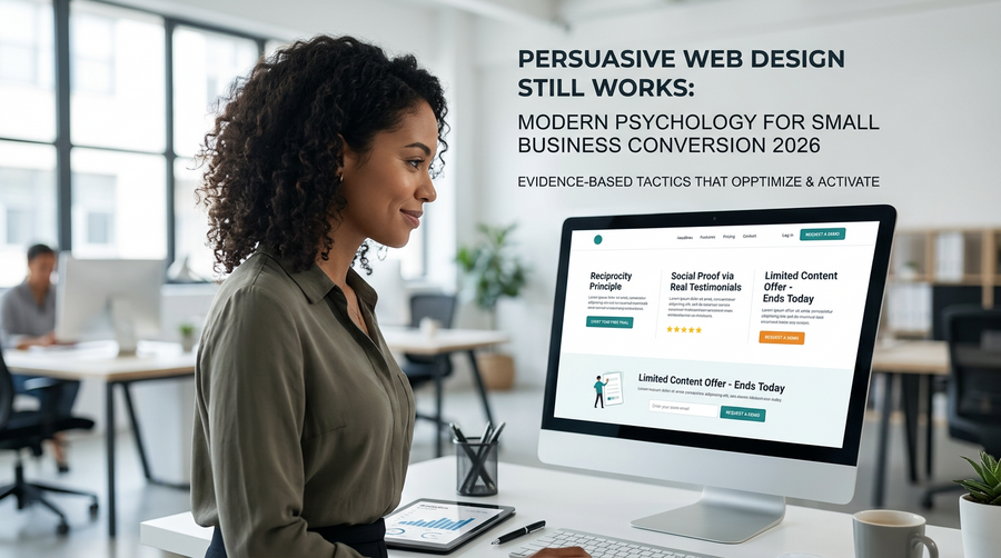
Generic trust badges (padlock icons, “100% secure” ribbons) have become wallpaper. Visitors scroll past them without registering what they say. What does work is specificity.
Consider these approaches instead:
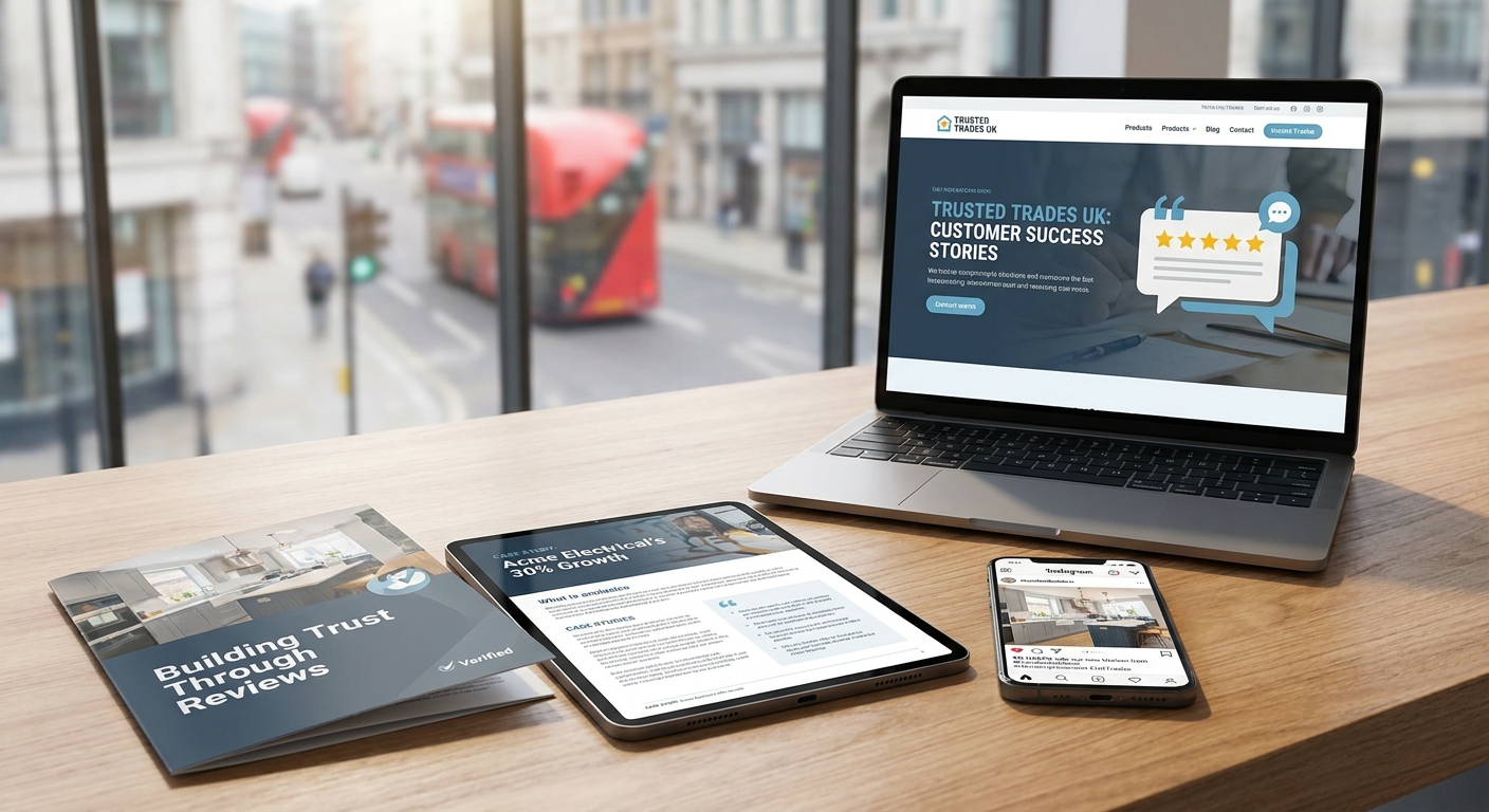
- Real testimonials with full names and locations. “Jane, Brighton” is more convincing than “J.B., South East England.” If you can add a photo, better still.
- Case studies with numbers. “We helped a local plumber cut their no-show rate by 30% after redesigning their booking flow” is concrete. “We deliver results” is not.
- Logos of recognisable clients or partners. Even regional brands carry weight if your audience will recognise them.
- Third-party review widgets. Pulling in your Google or Trustpilot rating live is more credible than a quote you wrote yourself.
The point is verifiability. Visitors in 2026 are more sceptical than ever, and they instinctively ask: can I check this? Make the answer yes.
Reduce the Cost of the First Step
One of the most consistent findings in conversion psychology is that people weigh the effort of starting against the uncertainty of the outcome. If the first action feels big, they stall.
Your job is to make that first step feel tiny. A few practical ways to do this:
- Replace “Request a Quote” with “Tell us what you need” or “Get a free 15-minute chat.” The latter sounds like a conversation, not a commitment.
- Use multi-step forms where the first question is easy (“What type of project is this?”) before you ask for contact details.
- Offer a no-strings freebie: a checklist, a short guide, a sample report. Something that delivers value before the visitor gives you anything.
This is sometimes called lowering the activation threshold. You are not tricking anyone. You are just removing the sense of risk that stops a fence-sitter from acting.
Use Social Proof at the Moment of Doubt
Timing matters as much as the proof itself. A testimonial buried in your footer is wasted. Place social proof right next to the action you want visitors to take.
On a contact page, put a short quote from a happy client directly above or beside the form. On a pricing page, show a review from someone in a similar situation to your target customer. If you sell to local businesses in West Sussex, a quote from another local business owner will resonate far more than one from a company in Manchester.
You can also use social proof to handle specific objections. If people worry about cost, find a quote where a client mentions value for money. If they worry about timescales, find one where someone praises how quickly the project moved. Match the proof to the hesitation.
Scarcity and Urgency: Use Them Honestly
Countdown timers that reset every time you visit, and fake “only 2 spots left” notices, are not just annoying. They erode trust the moment a visitor spots them, and visitors are good at spotting them.
Real scarcity and real urgency, though, are persuasive. If you genuinely have limited availability for new clients in a given month, say so. If a promotional rate is ending at a specific date, that is worth flagging. The key word is genuine. When the deadline passes, it passes.
For service businesses, capacity is often a natural constraint. A sentence like “We typically take on three new website projects per month” is honest, specific, and creates legitimate urgency without any tricks.
Make the Next Step Obvious at Every Stage
Persuasive design is not just about the moment of conversion. It is about the whole journey. Each page on your site should have one clear next action. Not five calls to action competing for attention, not a page that ends with nothing, just one obvious step forward.
For a home page visitor who is not ready to enquire, that might be reading a relevant case study. For someone who has just read that case study, it might be a specific invitation to get in touch. Think of your site as a series of small commitments, each one building on the last.
This is sometimes called the commitment and consistency principle. Once someone has taken a small step toward you, they are psychologically more likely to take the next one. Every piece of useful content they consume, every micro-action they take, warms them up slightly.
Keep Testing, But Test the Right Things
A/B testing button colours is the most common form of conversion optimisation and, usually, the least useful. The gains are marginal. The bigger wins come from testing your value proposition, your headline, the structure of your pricing page, or the wording of your main call to action.
If you do not have enough traffic for statistically valid A/B tests (most small business sites do not), qualitative research works just as well. Ask five real customers to talk you through using your website. Watch where they pause, what confuses them, what they say out loud. You will learn more in two hours than a month of Google Analytics staring.
The Practical Takeaway
You do not need a psychology degree to build a persuasive website. You need to understand who your visitor is, what they are worried about, and what would make saying yes feel safe and obvious.
Start with your contact page. Check that there is a genuine trust signal next to the form, that the first step feels low-risk, and that the call to action is clear and specific. Then work backwards through your site from there. Small, targeted changes in the right places will always outperform a full redesign that focuses only on how things look.
If you would like a second pair of eyes on how your site is currently performing, the team at Samson Web Design is happy to take a look. We have been helping small businesses in Worthing and across the UK get more from their websites since 2006.