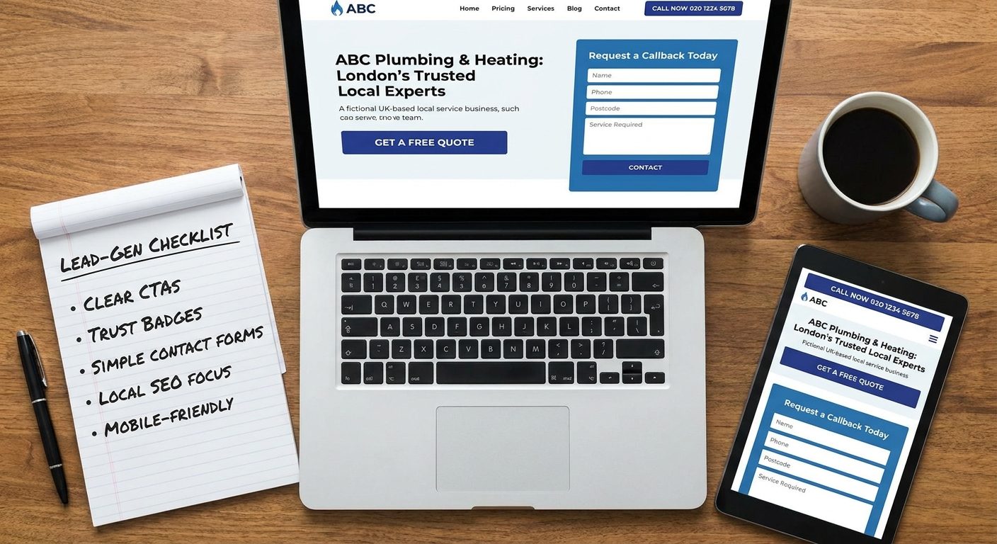
A plumber in Worthing pays for a smart new website. Six months later it gets 600 visits a month, and three of those visitors get in touch. He assumes the site "doesn't work" and wonders whether to spend more on ads.
Usually the traffic isn't the problem. The site is. The people arriving are searching for a plumber, and then they leave without finding a clear reason to call. This article is a checklist of what to change.
Why most trade websites get visitors but no enquiries
Most trade websites are brochures. They say who you are, how long you've been going, and list a few services. That's fine for a printed leaflet that someone reads in their own time. It's not much use to a homeowner with water coming through the ceiling, or someone comparing three loft conversion firms on their phone at lunch.
A lead-generating site works more like a salesperson. It answers the worried question in the visitor's head ("Can this person fix my problem, and what do I do now?") and then tells them exactly what to do next. Every page has a job, and the job is to get a person to make contact.
Decide what counts as a lead
Before changing anything, define a lead in plain terms. For a local service business it is usually one of these:
- A phone call from the website (a tap on the number counts)
- A contact or quote form submission
- A WhatsApp or text message
- A booked visit, survey or callback slot
Count each one separately. Plenty of owners only count form submissions, then conclude the site is dead when most of their enquiries are actually phone calls. If you don't know how many of each you get, you can't tell what's improving.
What a small change in conversion is worth
Take that Worthing plumber as an illustration. With 600 visits and 3 enquiries, he converts at 0.5 percent. Same traffic at 3 percent conversion gives 18 enquiries. That's six times the work from visitors he is already getting, with no extra ad spend. Even if he closes only a third of them, that's a very different month.
To be honest about it, design can't fix poor traffic. If nobody searches for you, or the wrong people find you, a better layout won't help much. What design decides is what happens to the visitors you already have, including the ones you're paying for through Google Ads or a directory listing.
The rest of this article works through the checklist in the order a visitor experiences it: the first screen, proof, forms, mobile, speed, local signals and tracking.
What a visitor decides in the first five seconds
People landing on a trade website don't read. They scan, looking for three answers:
- What do you do?
- Do you cover my area?
- How do I contact you?
If any of those is missing from the first screen, a good share of visitors will go back to the search results and try the next firm. They won't scroll to look for it.
A headline formula that works
Build your main headline from three parts: service, place and differentiator. For example: Emergency Boiler Repairs in Brighton and Worthing, Same-Day Visits. That one line tells the visitor what you do, where you do it and why you're worth ringing. It also helps search engines understand the page.
Compare that with the usual opener. "Welcome to our website" says nothing. "Quality service you can trust" is what every competitor says too. A strong hero section makes a specific promise and puts the phone number next to it, something like: Heating engineers in Worthing. Gas Safe registered. Call 01903 000000 for a same-day visit. (Use your own details, of course, and only claim what's true.)
What must be visible without scrolling
Check your site on your own phone, without scrolling. You should be able to see:
- The phone number, ideally as a tap-to-call button
- The main button, such as "Get my free quote"
- A short service area line, for example "Covering Worthing, Littlehampton, Shoreham and Brighton"
If a cookie banner or a big logo pushes all three below the fold, move things around until they fit.
Photos and sliders
Skip the rotating slider. Visitors rarely wait for slide two, and sliders slow the page down. Skip the stock photo of two people shaking hands as well. People can spot it instantly, and it makes you look like every other firm.
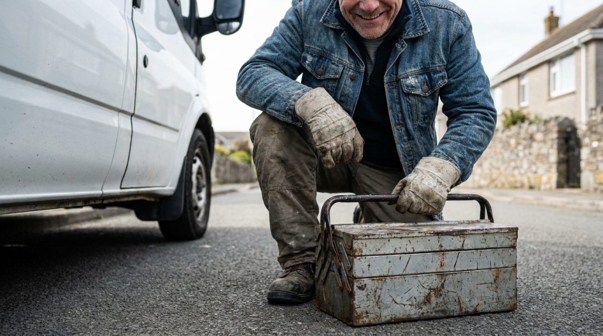
Use a real photo of your van, your team or a job you've finished. A clear picture of the actual person who will turn up at the door does more for trust than any amount of polished stock imagery. It doesn't need to be professionally shot, but it should be sharp and well lit.
Choosing one main call to action and making it obvious
Every page should push the visitor towards one primary action. Not three, not five. The wording depends on how your work is actually sold. It might be "Request a callback", "Book a site assessment" or "Get a free quote". If you can't say in a few words what you want a visitor to do on a page, they won't know either.
Match the action to the urgency
An emergency plumber, locksmith or drain unblocker is dealing with someone who needs help now. The main call to action should be a big call button, backed up by the number in plain text. A form is a poor fit for someone standing in a flooded kitchen.
Project trades are different. Someone planning a loft conversion, a new kitchen or an extension will take days or weeks to decide, and they don't want to phone a stranger yet. For them, lead with a quote request or a survey booking. A form they can fill in at 10pm after the kids are in bed will often outperform a phone number alone.
Where to put it
A simple pattern works well on most pages:
- Place the call to action near the first value statement, high on the page
- Repeat it straight after your strongest evidence, such as reviews or a before and after gallery
- Put it again at the foot of the page, so nobody reaches the end with nowhere to go
The aim is that when a visitor is ready to act, the button is already in front of them.
Button wording, colour and size
Vague labels like "Submit" or "Click here" give people no reason to press. First-person or outcome-led wording works better: "Get my free quote", "Book my site visit" or "Call me back today". The button says what the visitor gets, not what the website wants.
Make it large enough to tap comfortably with a thumb. Then give it a colour that appears nowhere else on the page. If your logo, headings and links are all orange, an orange button disappears. Choose a contrasting colour and keep it exclusive to the main action, so the eye is drawn straight to it.
Keep secondary actions quiet
You may well want to offer a downloadable price guide or a link to "View our work". That's fine, but those are secondary actions and shouldn't compete with the main one. Style them as plain text links or outline buttons, and place them lower down. If a page has three equally loud buttons, visitors often pick none of them.
Contact forms that people actually finish
A form is where most of your good intentions either pay off or fall over. The test is simple: ask only for what you need to reply well. For most trades that means a name, a phone number or email, the type of work, and a postcode or area. Timing can sit in as an optional extra.
Every extra field costs you completions. Someone on a phone, standing in a flooded kitchen or looking at a leaking roof, will not fill in eleven boxes. Cut "Company name", "How did you hear about us?", "Job title" and anything else that looks like it came from a fax-era enquiry sheet. You can ask those questions on the phone once you are already talking to a real customer.
A worked example: a five-field form for a roofer
Here is a form that gives a roofing firm everything it needs to make a useful first call:
- Name (single box, not separate first and last name)
- Mobile (set the field to a phone keypad on mobiles so the numbers appear straight away)
- Postcode (tells you instantly whether the job is in your area)
- Type of job (dropdown)
- Message (clearly marked optional)
The dropdown does more work than it looks like. Offer options such as "Leak or emergency repair", "Slipped or missing tiles", "Flat roof", "Full re-roof", "Fascias, soffits and guttering" and "Not sure". Now you can triage at a glance: the leak goes to the top of the pile and gets a call back within the hour, while the re-roof enquiry can wait for a proper site visit. It also saves the customer from staring at a blank message box wondering what to write.
The small print beside the button
Put a line of reassurance right next to the submit button, because that is the moment of hesitation. Something like "We reply within 2 working hours. No obligation." works well, provided it is true. If you can only manage next working day, say that instead. A promise you break is worse than a slower one you keep.
Change the button text too. "Submit" tells people nothing. "Get my free quote" or "Request a callback" tells them what they get.
UK GDPR without the clutter
You are collecting personal data, so include a short privacy notice under the form, along the lines of: "We'll use your details only to reply to your enquiry. Read our privacy policy." Link it to a real privacy policy page. If you want to send marketing emails later, use a separate, unticked checkbox. Pre-ticked consent boxes are not valid consent under UK GDPR, and you do not need one at all just to answer a quote request.
Finish with a proper thank-you
After the form is sent, do not leave the visitor staring at the same page wondering whether it worked. Send them to a thank-you page, or show a clear message, that says what happens next: "Thanks, Sarah. We'll ring you from 01903 xxx xxx within 2 working hours. If it's an emergency, call us now on..." Include your number, because a worried customer may want to call anyway.
A dedicated thank-you page, such as /thank-you, also gives you something to measure. Set it as a conversion goal in Google Analytics and in Google Ads if you run campaigns, and you can see exactly which pages and sources produce enquiries rather than just visits.
Where to put the quote form and how to make it reachable from every page
A request-a-quote option should be reachable from every page of your site, not buried on a Contact page that visitors may never open. The simplest approach is two layers: a "Get a quote" button in the header on every page, plus a short form built into your key service pages.
Short inline form or a longer quote page?
For most services, a short inline form on the page (the same four or five fields as above) is enough. The visitor has just read about boiler replacements or loft conversions, and the form is right there while their interest is warm. They do not have to go anywhere.
For complex jobs such as a full bathroom refit, an extension or a commercial contract, a longer dedicated quote page makes sense. There you can ask about property type, rough budget, preferred start date and let them upload photos. Link to it from the short form ("Got a bigger project? Tell us more here") so you serve both types of enquirer without scaring off the quick ones.
Keep it in thumb's reach on mobile
On phones, use a sticky bar fixed to the bottom or top of the screen with two buttons: "Call" and "Get a quote". It follows people as they scroll, so there is never a moment when contacting you takes effort. Keep the bar slim so it does not cover content, and make sure each button is large enough to tap without hitting the other one.
Where on the page it belongs
Do not put the form above any explanation. Someone needs enough context to understand why they are filling it in. Place it after the benefits and at least one testimonial, so the sequence runs: what you do, why you are trustworthy, now ask.
An example layout for a kitchen fitter's service page:
- Intro: two or three sentences on what you fit, the areas you cover and how long a typical job takes.
- Gallery: six to eight photos of real finished kitchens, each with a town and a short caption.
- Three reviews: genuine customer quotes with names and dates.
- Form: short, with the reassurance line and privacy notice underneath.
If the page is long, repeat a simple "Get a free quote" button partway down, so nobody has to scroll back up to act.
Proof that earns trust before anyone picks up the phone
Letting a stranger into your home or onto their roof is a big ask. Most visitors will look for evidence before they contact you, and if they cannot find it quickly they will try the next firm on the results page. Put proof where decisions are made, not tucked away on an "About us" page.
Accreditations and insurance
Show the badges that matter in your trade: Gas Safe for gas work, NICEIC for electricians, TrustMark, the Federation of Master Builders (FMB), Which? Trusted Trader, plus a line confirming your public liability insurance. Where a scheme issues a registration number, display your real one, so customers can check it on the register themselves. Only show logos you are entitled to use, and keep them current.
Reviews next to the call to action
Reviews on a separate page get read by almost nobody. Place two or three of your best Google reviews right beside the quote button or form, with the reviewer's name and the date. A real name and a recent date make a review believable. Link through to your Google profile so visitors can see the rest for themselves.
Real jobs, in real places
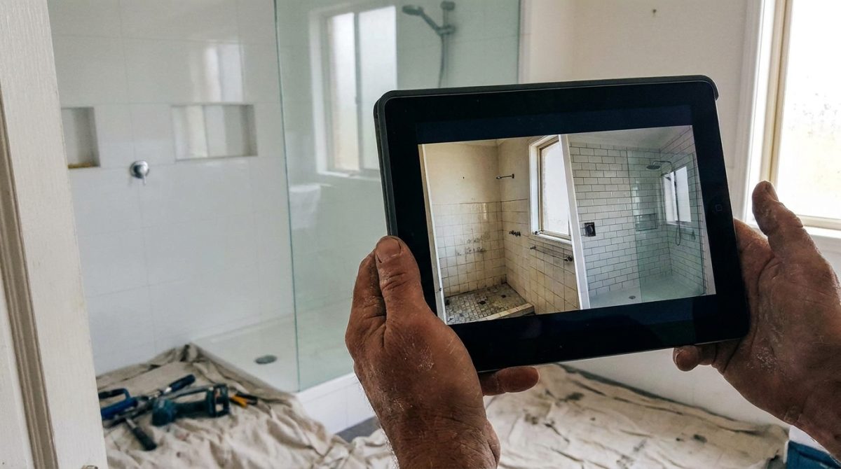
Before and after photos do more than any slogan. Use pictures of your own work, labelled with the location and a one-line description: "Re-pointed and re-roofed Victorian terrace, Broadwater, Worthing." Stock photos of smiling builders are easy to spot and do the opposite of building trust.
For bigger jobs, write a short case study in four parts:
- The problem: what the customer was facing.
- What you did: the work, in plain English.
- How long it took: for example, "four days from start to finish".
- What the customer said: a direct quote.
Guarantees and clear pricing
Promises like "fixed price quotes", "no hidden extras" or "workmanship guaranteed for 10 years" help people say yes, but only include them if you honour them in writing. Even a rough guide such as "Boiler installs usually start from £X" helps visitors feel less nervous about asking.
Finally, avoid fake or generic testimonials. "Great service, highly recommended" with no name attached reads as invented, and customers spot that quickly. One specific, honest review beats ten vague ones.
Service pages and location pages that match what people search for
Someone with a leaking boiler does not type "heating services" into Google. They type "boiler repair Worthing" or "combi boiler not heating water". A single crowded services page with twelve bullet points cannot rank for all of those, and it cannot speak to any one of them properly. Give each main job its own page: boiler repair, rewiring, bathroom fitting, whatever pays your bills.
Each page can follow the same simple structure, so visitors always find what they need in the same place:
- Who it is for. "Homeowners and landlords in Worthing and Littlehampton whose boiler has stopped working or is losing pressure."
- What is included. Call-out, diagnosis, parts, clean-up, certificates.
- A typical price or "from" price. Even "Boiler repairs from £90, most jobs under £250" filters out the wrong enquiries and builds trust with the right ones.
- The process. Three or four steps from first call to sign-off.
- FAQs. Covered below.
- One clear call to action. Repeat your quote button or form at the bottom, not just the top.
FAQs that answer the questions people ask before they ring
Think about what makes a customer hesitate, and answer it in plain words. How much will it cost? How long will it take? How much mess will there be, and will you put dust sheets down? What guarantee do you give on the work? Do you arrange the parking permit, or do I need to? That last one matters in any town with controlled parking zones, and almost nobody mentions it.
Pull these from real life. Your phone's call history and your inbox are a better source than guesswork.
Location pages: only where you really work
A page for each town you cover can work well, but only if it is honest. If you have never fitted a bathroom in Crawley, do not build a page claiming you serve Crawley. Google can spot near-identical pages with the town name swapped, and customers can too.
A good location page has local detail that could not be copied elsewhere: roads you work on regularly, the type of housing (1930s semis, seafront flats, new-build estates), a recent job with photos, and a review from a customer in that area. Two hundred genuine words beat six hundred recycled ones.
Link related pages together
Internal links keep people moving towards the form. A boiler repair page can link to "boiler servicing" and "new boiler installation", since a repair visit often reveals the boiler is past saving. A bathroom fitting page can link to tiling and plumbing. Each link should use descriptive wording, such as "see our boiler installation prices", rather than "click here", and every one of these pages should end with the quote form.
Designing for the phone in someone's hand
Most local searches for trades happen on a mobile, and often at a bad moment: water coming through a ceiling, a fuse box that keeps tripping, a van that has just failed its inspection. These visitors are in a hurry and sometimes stressed. They will use whichever site makes the next step easiest, so design with a thumb in mind, not a mouse.
Make calling effortless
Your phone number must be a real link, not just text. In the page code it looks like this: a link with the address tel:+441903000000 wrapped around the number. Tapping it then opens the dialler straight away. Put it in the header, and consider a sticky Call button fixed to the bottom of the screen.
Make every button at least 44 pixels tall, with space around it, so nobody hits the wrong thing with a thumb. Tiny text links crammed together are a classic fault on trade sites.
In your forms, use the right keyboard for each field. A phone field should bring up the number pad, and an email field should show the keyboard with the @ symbol ready. Developers set this with input types (tel and email), and it takes minutes. Turning on autofill saves typing too.
Keep navigation simple
A hamburger menu is perfectly fine on a phone for the full list of pages. Just keep Call and Get a Quote visible outside it, so your two most valuable actions are never hidden behind a tap.
Write in short paragraphs, use a font size of at least 16 pixels for body text, and avoid pop-ups that cover the screen. A full-screen offer box on a phone is hard to close, and Google may penalise intrusive ones in search results as well.
Test it properly
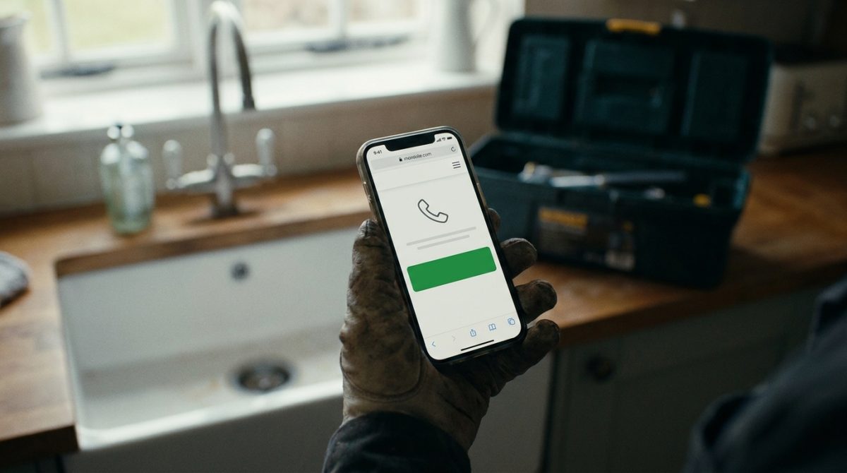
Do not trust the resizing tool on your computer alone. Pick up an older Android phone and an iPhone, and fill in your own quote form from start to finish on both. Note where you squint, mis-tap or get stuck. Then check that the enquiry actually arrives in your inbox.
If you can reply quickly, add WhatsApp or click-to-text as an extra route. Some customers would rather send a photo of the damp patch than talk on the phone. A link in the format wa.me followed by your number in international form (447 rather than 07) opens a chat directly. Only offer it if you will answer within the hour, otherwise it looks worse than not having it.
Speed, hosting and the technical basics that protect your enquiries
A slow page loses visitors before they have seen your offer. On a phone with patchy signal, a few seconds of blank screen is usually enough for someone to hit back and try the next result. Google's target is for the main content to appear in under 2.5 seconds, a measure called Largest Contentful Paint (LCP).
Images are usually the problem
The most common culprit we see is a 4MB hero photo, straight off a camera or phone, dropped onto the homepage. Fixing it is straightforward:
- Resize images to the size they are actually displayed, so a photo shown 800 pixels wide is not uploaded at 4000.
- Save them as WebP, which is usually much smaller than JPEG at similar quality.
- Lazy-load galleries so photos further down the page only load as people scroll to them.
- Do not lazy-load the main hero image, as that delays the very thing you want to appear first.
Measure rather than guess
Run your key pages through Google PageSpeed Insights (it is free) and test the mobile result, not just desktop. Then look at the Core Web Vitals report in Google Search Console, which shows how real visitors experience your site over time and flags pages that need work.
The unglamorous basics
Your site should run on HTTPS, which shows the padlock and protects anything typed into a form. Browsers warn visitors away from sites without it. Choose reliable hosting with servers in the UK, which helps speed for local customers and keeps support in your time zone.
Then check that your form emails actually arrive. Many sites send notifications through the web server's default mail, which often lands in spam or vanishes. Setting up SMTP, where emails go through a proper mail account, fixes most of this. Test by submitting the form from a Gmail address and an Outlook address, and look in the spam folder too. A form that silently fails costs you jobs without you ever knowing.
Accessibility helps everyone
Make sure text has strong contrast against its background (pale grey on white is hard to read in sunlight). Add descriptive alt text to images, such as "new walk-in shower fitted in Goring bathroom". Label every form field with visible text, not just placeholder text that disappears when someone starts typing. These steps help people with visual or motor difficulties, help everyone using a phone outdoors, and give search engines a clearer picture of your pages.
Local signals that bring the right visitors in the first place
A well-built site is wasted if the wrong people land on it, or nobody does. Local signals tell Google, and your customers, that you really work in their area. Most of them are free and take an afternoon to sort out.
Start with your Google Business Profile
For many trades, this listing is the first thing a customer sees, ahead of your website. Fill it in properly: choose accurate primary and secondary categories, list the services you actually offer, and add real photos of your work, your van and your team. Keep opening hours correct, including bank holidays, and post an update or recent job every few weeks. Reply to every review, good or bad, in a calm and polite way.
Link the profile to the same page and the same main call to action as your site, whether that is "Get a free quote" or "Book a site visit". Then track calls from it, either through the profile's call history or a tracking number, so you know what it brings in.
Keep your details identical everywhere
Your name, address and phone number (often shortened to NAP) should match exactly across Yell, Checkatrade, Facebook, Bing Places and any trade directory you appear on. "Smith & Sons Plumbing Ltd" in one place and "Smith Plumbing" in another muddies the picture. Pick one version and copy it everywhere.
Say where you work, in plain text
Put your service area and address in actual text on the site, not just in an image or logo. A line such as "Serving Worthing, Littlehampton, Shoreham and the surrounding towns" in the footer and on key pages does a lot of work. If you have public premises, such as a showroom or workshop, add an embedded Google Map. If you work from home, show the area you cover instead of your home address.
Earn a few local links
Links from respected local sites carry weight. Good sources include:
- Your local chamber of commerce
- Trade bodies you belong to, such as the one behind your accreditation
- Suppliers and manufacturers who list approved installers
- Local charities or clubs you sponsor
Even three or four relevant links beat dozens of random directory listings.
Measuring what works and a final pre-launch checklist
Track three things: form submissions, phone calls (through call tracking or click-to-call events) and the source of each lead. Google Analytics 4 shows you what visitors did, and Search Console shows which searches brought them to you. Set up the thank-you page as a conversion so every form completion is counted.
Once a month, look at which pages produce enquiries and where visitors drop off. Then change one thing at a time, such as the headline or the form length, so you know what made the difference.
Also ask every new customer how they found you, and compare their answers with the data. Word of mouth and "I saw your van" will never show up in analytics, and that gap is worth knowing about.
Quick pre-launch checklist
- A clear headline saying what you do and where
- One main call to action, repeated sensibly
- A short form
- A visible phone number
- Real proof: reviews, photos, accreditations
- A mobile test on an actual phone
- A speed test
- A privacy notice linked from the form
- Thank-you page tracking switched on
If your site is more than three to four years old, or enquiries have plateaued despite your tweaks, that is the time to bring in a web designer. A fresh pair of eyes will usually spot what you have stopped seeing.