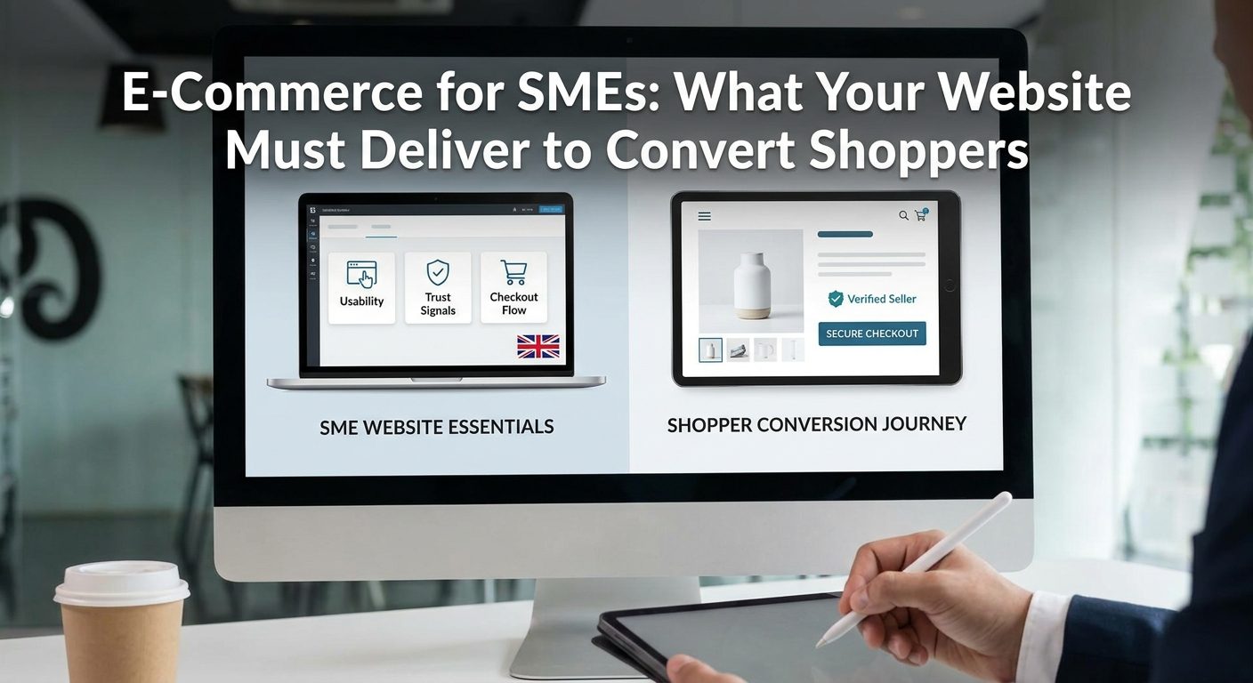
Seventy percent of UK shoppers who add something to an online basket never complete the purchase. That single stat should unsettle any small retailer who thinks launching a website is the hard part. Getting traffic costs money and effort; losing that traffic on a poorly designed product page or a clunky checkout costs even more.
The mechanics of why this happens are well understood, yet the same mistakes keep appearing on small business sites week after week. Understanding exactly where and why shoppers drop off is the first step to fixing it.
Why Most Small Retailer Websites Lose Sales Before the Basket
UK e-commerce sales topped 120 billion GBP in 2023, and the market keeps growing. But cart abandonment rates hover between 70 and 75 percent across all sectors, which means the vast majority of potential revenue disappears before a single payment is processed. For a small retailer with modest traffic, even a five-percent improvement in conversion can double monthly revenue without spending an extra penny on advertising.
Small retailers tend to lose shoppers at three specific moments. The first is slow page load, where a visitor waits more than three seconds and simply hits back. The second is unclear product information, where a shopper cannot work out the size, material, or delivery timeframe and decides the uncertainty is not worth the risk. The third is a checkout that asks for too much too soon, demanding account creation or burying shipping costs until the final screen.

None of these problems are about budget. A five-thousand-pound custom build can fail at all three points just as easily as a free Shopify theme. The gap between a website that exists and one that converts is not about platform prestige or design complexity. It is about whether the site answers the shopper's unspoken questions at every step of their journey: is this safe, is this right for me, and will it actually arrive?
This article works through each conversion layer in sequence, from the first impression a visitor forms in under two seconds to the post-purchase confidence that turns a one-time buyer into a repeat customer. By the end, you will have a practical checklist you can start working through this week, without needing a developer on speed dial for every item.
First Impressions Are a Speed and Clarity Test
A shopper who lands on your homepage gives you roughly 1.5 to 2 seconds before they decide whether to stay or leave. In that window, your site is not being judged on your brand story or your range of products. It is being judged on one thing: does this feel fast, clear, and trustworthy enough to bother with?
Speed is not a nice-to-have
Google's Core Web Vitals benchmarks set a Largest Contentful Paint target of under 2.5 seconds, meaning the main visible content of your page should finish loading within that window. Sites that miss this threshold face measurable drops in search rankings and higher bounce rates, since Google treats page experience as a confirmed ranking signal. For a small retailer already competing against larger brands with bigger SEO budgets, handing away ranking positions because of a slow hero image is an entirely avoidable problem.
Mobile traffic now accounts for roughly 60 percent of UK e-commerce visits. That means your 390-pixel-wide smartphone layout is not a scaled-down version of your real website; it is your primary design canvas. If buttons are too small to tap, images take four seconds to load on 4G, or text requires pinching and zooming, the majority of your visitors are having a poor experience before they have seen a single product.
Practical speed fixes you can apply now
Image compression is the single highest-impact, lowest-effort fix for most small retailer sites. Tools like Squoosh (free, browser-based) and ShortPixel (integrates directly with WordPress) can reduce a 2MB product photo to under 150KB with no visible quality loss. A homepage that loads five uncompressed images is adding several seconds of unnecessary wait time for every visitor.
Hosting matters more than most small business owners realise. A shared hosting plan on a US-based server adds latency for UK visitors. Choosing a hosting provider with UK-based data centres, or using a content delivery network that caches your assets closer to your shoppers, reduces that latency measurably. This is worth asking your current host directly before assuming you need to switch platforms entirely.
Heavy slider scripts are another common culprit. Rotating homepage banners look impressive in a sales pitch but they delay rendering, confuse visitors who miss the first slide, and consistently underperform a single static hero image in A/B tests. The data on this has been consistent for years, yet sliders remain one of the most requested features from clients who have not seen that data.
Clarity is the other half of the test
Speed gets a visitor to stay. Clarity gives them a reason to. The content above the fold on your homepage needs to answer three questions without the visitor having to scroll or click anywhere:
- What do you sell?
- Who is it for?
- Why should I stay rather than go back to Google?
A single strong headline that names your product category and your point of difference, paired with one clear call-to-action button, consistently outperforms a homepage cluttered with promotional banners, seasonal sale messaging, and four different navigation prompts competing for attention. The reason is straightforward: every additional choice on a page increases the cognitive load on the visitor. Reduce the choices, and more people take the one action you actually want them to take.
That call-to-action button should be specific rather than generic. Shop handmade leather wallets outperforms Shop now because it confirms to the visitor that they have landed in the right place. It also carries a keyword signal that helps with organic search, which is a bonus rather than the primary reason to do it.
Product Pages That Do the Selling for You
When a customer walks into a physical shop and picks up a product, they get immediate answers to a dozen small questions: how heavy is it, what does the texture feel like, will it fit, does the colour match what I saw online? Your product page has to replicate every one of those reassurances without the customer being able to touch anything.
A product page that does its job well behaves like a knowledgeable, honest shop assistant. That means covering size, material, weight, compatibility, care instructions, and honest stock status as standard. Each one of those details is a potential objection the shopper is silently holding. Leave any of them unanswered and you have given them a reason to close the tab and buy from someone who answered it.
Images do the heavy lifting
Multiple product images from at least three angles are not optional for competitive categories. For apparel and homewares in particular, image quality is consistently rated the top purchase driver in consumer research, ahead of price and delivery speed. A lifestyle shot that shows the product in use or demonstrates scale, for example a bag photographed next to a MacBook, answers the size question more clearly than any written measurement.
Zoom functionality matters too. Shoppers buying clothing, jewellery, or any product where texture or finish is relevant will try to zoom in. If your images are too low resolution to zoom cleanly, or your platform does not support zoom at all, you are losing the shoppers who care most about quality, which is often exactly the customer worth winning.
Structure your descriptions for two audiences
Product descriptions serve two audiences simultaneously: the human shopper and Google's crawler indexing your catalogue. Walls of unbroken text fail both. A structured description with a short plain-English benefits summary at the top, followed by bullet-point specifications, is easier to skim for a shopper on a mobile screen and easier for a search engine to parse for relevant keywords.
The benefits summary should answer the question why should I buy this in two to three sentences. The spec list then answers what exactly am I buying. Separating these two functions, rather than blending them into a single paragraph, reduces the reading effort for the visitor and increases the chance they find the specific piece of information that removes their last objection.
Social proof from verified buyers
User-generated reviews are one of the most effective trust tools available to a small retailer, particularly for first-time visitors who have no prior relationship with your brand. A star rating widget pulling from a verified review platform, Trustpilot for general retail or Judge.me for Shopify stores, adds credibility that your own product copy cannot. Shoppers are conditioned to distrust claims made by the seller; they are far more willing to trust claims made by other buyers.
According to Hiscox's guidance on online stores, pairing secure payment systems with clear delivery information is a key lever for building customer confidence. Reviews that mention delivery speed and packaging quality reinforce this at the product level, before the shopper even reaches the checkout.
Urgency without manipulation
Stock scarcity messages such as Only 3 left in stock and clear dispatch information such as Order before 2pm for next-day dispatch create genuine urgency based on real information. These are fundamentally different from countdown timers that reset every time the page loads, which shoppers increasingly recognise and distrust. Legitimate scarcity works because it is true; manufactured scarcity backfires the moment a shopper notices it is fake.
Dispatch time promises deserve particular attention. Shopify's community guidance on product content highlights that keeping information accurate and up to date, including delivery estimates, is a core part of maintaining both conversion rates and search performance. A promise you cannot keep damages trust far more than no promise at all.
Cross-selling keeps shoppers in your store
A shopper who views a single product and finds nothing to draw them further into your catalogue is one back-button press away from leaving. Cross-selling modules showing Customers also bought or Complete the look serve two purposes at once. They raise average order value by surfacing relevant complementary products, and they keep the shopper engaged long enough to build the browsing habit that precedes a purchase decision.
The key word is relevant. A cross-sell that makes obvious sense, showing shoe care products on a leather boot page for example, feels like helpful service. A cross-sell that appears random, driven by whatever happens to be in stock, adds noise rather than value. Most e-commerce platforms allow you to set manual cross-sell relationships per product, which takes more time than automated suggestions but produces noticeably better results for smaller catalogues where the relationships are easy to curate.
Building the Trust Signals That UK Shoppers Actually Check
Trust is not decorative. It is a direct conversion factor, and UK shoppers are experienced enough to scan for the right signals within seconds of arriving on a page they have never seen before. Getting the basics right costs almost nothing and removes a significant barrier to the first purchase.
Start with HTTPS. The padlock icon in the browser bar is the absolute baseline, and browsers now actively display warning messages on non-HTTPS sites that push cautious shoppers away before they even read a word. Most UK hosting providers include free SSL certificates through Let's Encrypt, so there is genuinely no excuse for skipping it. A site flagged as 'Not Secure' signals unprofessionalism regardless of how good the products are.
Beyond the padlock, display a UK phone number, a physical address, and a clearly written returns policy. The UK Consumer Contracts Regulations give online shoppers a 14-day right to return goods, so spelling this out in plain English builds confidence rather than undermining it. Shoppers who can see you have a real address and a real number to call are far more likely to complete a purchase than those left wondering whether you exist.

Payment trust badges from Visa, Mastercard, PayPal, and Apple Pay should appear both in the site footer and at the point where shoppers first enter the checkout flow. Burying them in an 'About' page or a terms document means most shoppers will never see them. Place them where the purchase decision is actually being made.
A jargon-free privacy policy and a properly implemented cookie consent mechanism are legal requirements under UK GDPR, but they serve a secondary purpose too. A business that handles data professionally signals to shoppers that it is legitimate and properly run. A cookie banner that gives real choices, rather than hiding the reject option, reinforces that impression.
For social proof, third-party review platform logos carry far more weight than testimonials you have written yourself. Platforms like Trustpilot, Google Reviews, and Feefo are understood by shoppers to be independently verified, which is exactly the point. Aim for a minimum of 20 verified reviews before making the widget prominent on your homepage or product pages; a handful of reviews can actually look worse than none at all.
Finally, invest time in your About page. Real team photos, a founding story with actual dates and details, and a named location build a human connection that Amazon and other large marketplaces genuinely cannot replicate. A shopper choosing between your independent store and a faceless marketplace is often looking for a reason to choose you. An honest, personal About page can be that reason, and it costs nothing but an hour of your time to write.
Checkout Design: Removing Every Reason to Abandon
The checkout is where intention meets friction. A shopper who has found your product, decided they want it, and added it to the basket is already a warm lead. The checkout's only job is to not get in their way.
The single biggest driver of checkout abandonment, consistently across UK and international research, is being forced to create an account before completing a purchase. Many shoppers, particularly first-time visitors, will simply leave rather than hand over an email address and create a password at that stage of the journey. Always offer a guest checkout path as the default option, and then offer account creation as an optional bonus on the order confirmation screen, once the purchase is already done.
Keep the checkout to three steps or fewer: delivery details, payment, confirmation. Each additional screen and each additional form field is a statistical leak. If your platform asks for a fax number, a date of birth, or a second phone number, remove those fields. Every piece of information you request beyond what is strictly necessary for delivery and payment is a reason for someone to stop and reconsider.
Mobile checkout speed is especially important. Platforms like Shopify's accelerated checkout and WooCommerce with Stripe Checkout support one-click payment options via Apple Pay, Google Pay, and PayPal Express. When these are configured correctly, a mobile shopper can complete a purchase in under 30 seconds without typing a card number at all. That is not a marginal improvement; for shoppers on a phone during a commute or a lunch break, it is the difference between a sale and an abandoned session.
Cost Transparency Kills the Surprise That Kills the Sale
Unexpected shipping costs revealed on the final screen are the second most cited reason for checkout abandonment in UK consumer research. The fix is simple: show estimated shipping costs on the product page itself, or at minimum in a persistent basket summary panel that updates as the shopper browses. Do not hide delivery costs until the last moment. Shoppers who feel ambushed do not complete the purchase, and they often do not come back.
If you offer free shipping above a threshold (say, free delivery on orders over £40), display that threshold clearly and persistently. A line that reads 'Add £8.50 more for free delivery' in the basket is a genuine conversion tool, not just a notification.
Recovering Baskets That Do Get Abandoned
Even a well-designed checkout will see abandonment, because life interrupts purchases. An automated abandoned cart email sequence, triggered through tools like Klaviyo, Mailchimp, or Shopify's native email tools, recovers an average of 5 to 15 percent of those baskets when the first email is sent within one hour of the abandonment. A sequence of two or three emails over 24 to 48 hours performs better than a single message, though the first one carries the most weight.
Post-purchase confirmation matters too. A clear order confirmation email with the order reference, an expected delivery window, and a tracked shipping link removes the anxiety that generates 'Where is my order?' support queries. Services like Royal Mail Click and Drop and DPD Local integrate directly with most UK e-commerce platforms, so providing a tracking link is a configuration step, not a custom build. Shoppers who know exactly where their parcel is are satisfied shoppers, and satisfied shoppers come back.
According to guidance on tracked shipping for SMEs, pairing secure payment processing with clear delivery confirmation is one of the most practical steps a small online retailer can take to build customer confidence from the first order onwards.
Getting Found Locally Before You Chase a National Audience
There is a temptation, especially early on, to aim at the broadest possible audience. Resist it. For most UK small retailers, competing for a term like 'handmade candles' against established national brands and Amazon marketplace sellers is an expensive way to rank on page four. Competing for 'handmade candles Worthing' or 'trade workwear supplier West Sussex' is a different game entirely, and it is one you can win faster and for far less money.
Local and regional search niches are underserved by large retailers who have no reason to target them. A well-optimised small business with genuine local signals can dominate these searches within months rather than years, and the shoppers it attracts are precisely the ones most likely to buy, because proximity and local relevance are part of why they searched that way in the first place.
A fully completed Google Business Profile is the highest-leverage free action available for local search visibility. Accurate NAP details (name, address, phone number) must match your website exactly. Discrepancies between your GBP listing and your website contact page confuse Google's local algorithm and reduce your visibility in the local pack and map results. Add photos, keep your hours updated, and respond to every review. An actively managed profile consistently outperforms a neglected one.
On-site, your category structure affects how efficiently Google can crawl and index your full product catalogue. A flat, logical hierarchy of home, category, subcategory, and product keeps every page within a few clicks of the homepage and supports strong internal linking. Sites with deeply nested or inconsistent structures often find that Google indexes the homepage and a few top-level pages, then stops. That means product pages, which are where the actual purchase happens, never appear in search results at all.
Backlinks from local sources build the Prominence signal that Google's local algorithm weighs alongside proximity and relevance. Regional directories, trade association membership pages, local press coverage, and supplier partner pages all count. One link from a local Chamber of Commerce page or a regional trade publication carries more local SEO value than ten generic directory submissions. Identify five realistic local link opportunities and pursue them before worrying about anything more complex.
The practical takeaway from all of this is that good web design and good local SEO are not separate projects with separate budgets. Every decision that makes your site faster, clearer, and easier to use on mobile also sends positive signals to search engines. Optimising page content and user experience simultaneously improves your conversion rate and your rankings. Build the site right once, and both benefits compound over time. That is the most cost-effective strategy available to a small retailer, and it is where your energy should go before any paid advertising spend enters the picture.